“Are you tired of your website looking outdated and clunky on mobile devices? It’s time to upgrade to a responsive WordPress theme. But with so many options out there, it can be overwhelming to know what features to look for.
Don’t worry, we’ve got you covered. In this post, we’ll explore the top criteria that make a WordPress theme truly responsive and user-friendly on any device.”
Introduction to Responsive WordPress Themes
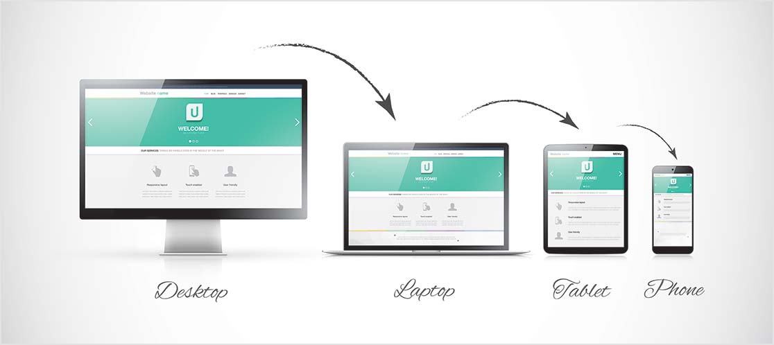
A responsive WordPress theme is a theme that has been designed to work well on a range of devices, from small screens to large screens. Responsive themes are becoming more popular as more people use their mobile devices to access the internet.
There are a few things you should look for when choosing a responsive WordPress theme:
1. The theme should be designed to work well on all devices.
2. The theme should be easy to customize.
3. The theme should have a good selection of features.
4. The theme should be compatible with the latest version of WordPress.
What to Look for in a WordPress Theme
There are a few key things to look for in a responsive WordPress theme:
-First, make sure the theme is truly responsive. This means it will resize and rearrange itself to look good on any screen size, from a small mobile phone to a large desktop monitor.
-Second, check if the theme has been designed with SEO. A good, responsive WordPress theme will include features like clean code and semantic markup, which will help your website rank higher in search engines.
-Third, take a look at the design of the theme. A good, responsive WordPress theme will be pleasing to the eye and easy to navigate. Ensure the layout is logical and that the fonts and colors are easy on the eyes.
-Make sure the theme is compatible with all the major browsers. A good, responsive WordPress theme will work equally well in all major browsers, including Internet Explorer, Firefox, Safari, and Chrome.
Choosing a Theme Based on Your Needs
When looking for a responsive WordPress theme, it’s essential to consider what you need from the theme to create a successful website. There are a few key things to look for:
-Ease of use: You want a theme that is easy to use and understand so that you can focus on creating content rather than learning how to use the theme.
-Flexibility: A good, responsive WordPress theme should be flexible enough to allow you to change things as your needs change.
-Customization: You should be able to customize the look and feel of your site with the theme so that it truly reflects your brand.
-Support: Choose a theme from a company that offers good customer support in case of any problems.
Features to Look For in a WordPress Theme
When choosing a WordPress theme, there are many things to consider. But if you’re looking for a responsive theme, there are some key features you’ll want to look for.
First, you’ll want to make sure the theme is responsive. This means it will adjust to fit any screen size, whether a desktop, laptop, tablet, or smartphone.
Next, you’ll want to look for a theme designed with SEO. This means the code is clean and well-organized, and the theme includes features like social media integration and easy customization.
You’ll want to choose a theme compatible with the latest version of WordPress. This ensures you’ll have access to the latest features and security updates.
Other Things to Consider
It’s important to consider other factors when choosing a responsive WordPress theme for your website. Here are a few things to keep in mind:
– Ease of use: You want a theme that is easy to use and customize, so you don’t waste time fiddling with settings.
– Compatibility: Make sure the theme is compatible with the plugins and software you’re using on your website.
– Support: Choose a theme from a reputable source that offers good customer support in case of any issues.
Tips for Customizing Your WordPress Theme
When you are looking for a responsive WordPress theme, you should keep a few things in mind. First, you want to make sure that the theme is responsive. This means that it will resize itself to fit any screen size.
Second, you want to ensure the theme is easy to customize. This means that you can change the theme’s colors, fonts, and layout without having to code anything.
Third, you want to ensure the theme is compatible with all of the plugins and themes you use. This means you won’t have to worry about compatibility issues when updating your site.
You want to make sure that the theme is well-supported. This means that if there are any issues with the theme, there is someone who can help you fix them.
Conclusion
A responsive WordPress theme is essential for success in today’s digital world. There are many factors to consider when selecting a good one, such as features, design elements, customization options, etc.
We hope this article has provided some helpful guidance on what to look for in a responsive WordPress theme so that you can make the best choice for your website.
With the proper selection of features and visuals, your site will be well-equipped to compete with those of even the most prominent brands!